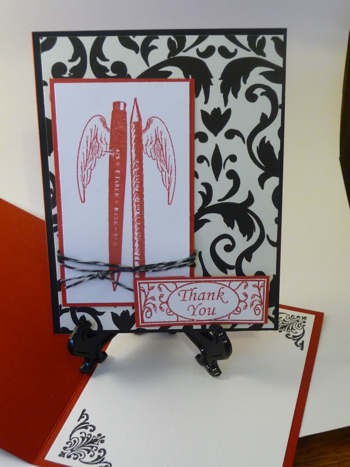
Cards created this year to send to our Nation's Heros....24
Showing posts with label Tim Holtz. Show all posts

Monday, November 4, 2013

My New Favorite Wine Treat!

I am having so much fun making these bottle hangers.  Since they don't have to fit in an envelope they can hang over and be as thick as I can possible make them!  This was hung from a bottle of bubbles (would have been nice to take a pic, huh!)
I don't do a lot of steam punk but I had a paper pack still and I thought it would be a perfect mesh (pun intended!) with Momma's Mesh.  The flap is tucked back but it just 3 inches longer, rounded on the end with a big circle punch to hang it from the bottle.
I am on the Monday Mesh team over at Lovebug and super excited for this to be my first project.  As usual... Let's start at the bottom.  Way under there is a blue/green sheet from the collection to just be a 'base'.  Then I picked an image I really liked and trimmed/layered it off the right side.  


 Before I adhered it down I wrapped it with some 'Where's Everybuggy' ribbon and hung a TH trinket pin with some charms from my stash.
Next FLOWERS!  Petaloo in perfectly coordinating colors.  I took one of each set and painted with gold dauber.  I needed some bling ;)
Finally... to totally make this work - I added a strip of mesh in the lower left hand corner.  Topped that with a smaller image from the 8x8 paper pad.  A few random gears and Viola - A beautiful way to give a bottle.


Friday, May 3, 2013

Altered Tim Holtz Ideology Assemblage Clock with Graphic 45 French Country


 I was so excited to FINALLY get my hands on this clock.  From the very beginning I knew I wanted to alter it with this great G45 line and stuff it with a super fun mini (coming in a few weeks)
And it was even more fun than I thought it would be!!  I put a coat of paint on to shab it up a bit, and then just layered on flowers some spell binders cut to frame the 'face' and pieces from the paper collection.  This was such fun!!  To get a better link and a bit more dialog about what I did the link to the  youtube video = click here

You can purchase the Tim Holtz Ideology Clock, Graphic 45 French Country collection, and hundreds of other craft supplies at 25% off of MSRP at Lone Wolf Designs, LLC! Check it out at www.lonewolfdesignsllc.com. If you're buying your craft supplies anywhere else, you're paying too much!

Thursday, September 27, 2012

Vintage Upcycled Paper Bag

Upcycled Paper Bag for YPP I just love the Upcycled bag swaps. We take a regular everyday lunch bag and make it lovely. You can make it with the bottom still square to fill with a gift. I did some like this to give away garden herbs this summer. Or you can make it flatter for a gift like a card or certificate or with a really flat back to add to a mini album with some tags.
I made this one more as a mini insert in mind. I didn’t make the tags, because I just thought it would be better to make tags to coordinate with what the recipient’s theme was. To start, I pulled the bottom flap up and this created a pocket. At the top of the pocket (and not real visible here I added a trim punched with a simple edger on black cardstock. Next I layered that red on red piece from K&Co Engraved Garden paper pack. If you look closely – you will see perfume bottles, corsets, martini glasses, shoes, all girly treats. Before I adhered that piece down I took a buckle (that used to be silver but I colored with a gold dauber). Then I set it on an angle. We usually use a straight line, or I do at least. But I left this open in the front to hold a tag or photo. I made that stickpin to pull in all the colors I was working with and secured it in the ribbon (Nero by Stampin Up). On the top potion I started with a piece of black cardstock run through a script cuttlebug folder which I lightly ran a versa pad over and dusted on some gold perfect pearls. And a touch of vanilla smooch spray to set it. Next I found the image (always a requirement on the YPP paper bag swaps). It is a corset layered over sheet music. I was looking for a great vintage corset to stamp sheet music on… or maybe I would have printed it on a piece, but it came already put together…yeah. I edged that in two shades of reddy/pink from SU (Riding Hood Red and Cherry Cobbler) I like the effect of two coordinate colors giving a darker line to the edge. Then, I tipped the very edges with walnut stain from TH. I distressed the edges with water, I saw this on a youtube vide and just love the effect. After the reds and walnut are both applied just dip a brush in water and pull that dark brown in towards the image. It grabs the reds with it and really makes a nice blend. Also, it curls the edges a bit for a truly old look. I used some leaves from the bridal section at Michaels (I only go there in that aisle I swear!) The little mulberry roses are IAmRoses and the larger brown and cream are velvet ones from prima I found on CloseOutGirl’s etsy shop. I added a gold brad in the center to bring in the gold of the buckle. That left a hole on the left side which I filled pretty easily. A SU punch of red cardstock, a crown stamped with versa mark and touched with gold perfect pearls. I also ran a versa mark pen on the edges and gave it the gold pearls, too. I though this made it look more like a frame, though it doesn’t show well in the photo. A smooch spray to set and gold brads to make it look anchored to the image. I think these turned out nicely and I can’t wait to see what comes my way!!

Tuesday, July 24, 2012

All Corked Up

Your Paper Pantry has started a brand new swap group all about wines! I am having so much fun with it. Last month was the wine glass charms and this month was key chains made with corks. I love cork projects!! I have a lot of corks around the house and love an excuse to use them up.
These were a bit of a challenge for me. The examples I could find on line were too plain – so I did mine up a bit. ;)

Basically, I made a chunky charm using some wine themed charms from Oriental Trading and coordinating beads from who knows where. You shop there, too, right..
To affix the decoration to the cork we used small closed eye screws. I used one on top to add the charms and key ring and one on the bottom, where I added a really unique and wine specific bead/charm… just one, can you believe it! My key rings are not for everyday use… nope. These are for one key that you drop off at the neighbor to water your plants when you are out of town.
The tags, I think are really nice. I hope people can use them on a wine bottle on a gift maybe.
I started with a standard tag and a great sheet of Fiskars wine related stamps. In the corner I stamped the leaves and filled them in with my Copics – any excuse for practice, right?
I layered on a plain – yep, not decorated or altered at all, sheet of rich purple and tore the edge by leaves for interest. Next I cut a half circle and stamped a single leaf with TH tea dye all over it and inked it up. While I was at it, I inked the leaf corner and the top – which begged for some single leafs, too.
That looked a bit plain so I added the wine glass and ‘cheers’ and Copic’d the wine. I toyed with making it a red wine, but I didn’t have the right colors and I like how the golden hues are more muted. I had a great sheet of wine paper that I punched with the SU label punch and punched a cream and purple layer, too.
Finally, I thought some
bling was in order. A nice strip to accentuate the curve of circle – to me it looks like a ring left by a glass. A few on the leaves and some swirls so that purple isn’t so plain.
Three of these are on the way to Stacy and I can’t wait to get mine in return.
If you aren’t swapping at YPP – check it out. I love that the sign ups are all on the same day and they are all due the same day of the month. It makes it really nice to stay organized. Not to mention, the quality of the swaps is really outstanding.

Monday, May 21, 2012

Mojo Monday

I went in search of mojo and found this great MoJo Monday sketch.  I didn't follow it to the letter.  Operation Write Home cards tend to be a big on the simpler side.  But I think this has just enough to make it fabulous and not too much to be busy.
http://mojomonday.com/Sketches/Mojo240Sketch.gif
What I liked about this image was the large circle as a focal point.  That seemed a great way to showcase some of the beautiful Echo Park papers I have been hoarding.  So I first selected the butterfly print as my focal.
I started with a kraft colored card base and a front in Rich Razzleberry.  That color was just a bit too bright for the EP paper line so I inked the edges with Tim Holtz Tea Dye.  And stamped my favorite large script, also in tea dye.  That brought the base down to a softer feel.
I just love making my own background papers with Perfect Pearls or embossing or stamped images and decided to do that with the side panel here.  I started with a piece of yellow faux parchment.  Next, I cut out butterflies from the coordinating EP paper with a Martha Stewart punch and glued them down.  Then I ran that concotion through an embossing folder.  The finished look is as if the butterflies are part of the paper.  Really sharp.
The butterfly paper I selected as the focal point was cut with a SU 2.5inch punch. I layered that on a pointy nestabilities die and one final time on the slightly larger brown. I didn't like it just on the pink or just on the brown and this combination seemed to give the best effect.
While I like the circle and pennant on the original sketch, all my attempts just felt like to much on an OWH card.  Though I could see using it for a fellow cardmaker.  I needed to tame it down, keep it flat enough for the USPS and stay with my kind of mellow color pallet.  So I punched holes and threaded the bow through.  I really like that.  Originally, I had thought about adding another butterfly, but when I did it was just too cutsey.  (Heaven forbid!)  Which meant the ribbon on the bottom would be two fibers, which I rarely ever do.  But the punched sentiment gave it that horizontal fee.  In hindsight, maybe I should have layered on the circle and the side panel.
This kraft card base needed a white liner on which I added a little bit of the DP and stamped butterfly.
So - my Monday Mojo toned down made 4 (not so quick cards) for OWH.

Monday, April 2, 2012

Mojo Booster


I have been a bit low on mojo lately.  Not sure if is spring fever, the new baby, the new other stuff – but life is good and I am crafty as much and as often as I can – if not as often as I would like.  Just like with energy and a body in motion stays in motion, I think the craft mojo stays fueled if keep crafting.  When I slack off the pool gets lower.
This weekend was the first time I had big blocks of  time to make some cards for Operation Write Home.  But, alas, the mojo was nowhere to be found.  I made six of these pretty red/black and white cards with a great stamp from the Michael’s dollar bin.  But I had to drag that simple design out.  And at this rate, I would have nothing to show for all this crafty time. 
I have a Stampin UP set, Nature Walk, that I love – LOVE and really wanted to use, but no ideas.  The images are a bit more vintage than I usually do, so working with them is a challenge for me.  To kick start things I started on Youtube and found this video and straight up cased her card!  Three of those for the box.
Next, I decided to use the google image feature and just put in Stampin Up Nature Walk cards and literally hundreds of lovely cards popped right up.  I just cased my way through the list.   
The pretty blue design is based on a great basic sketch I am going to go to again and only required a tiny amount of pattern paper.  Would be great for that stuff we love and hoard.  I used a big beautiful pearl brad from Wild Orchids and a bit of linen thread from Stampin UP. I made four of these in about an hour.
Then, I saw this masked card.  I haven’t done any masking, I don’t know why!  I used a nestabilitie die to pop out a square and put down some ink for the yellow background, then did a lot of that so nerve wracking direct to paper stamping.  Vivid colors, simple designs – they do it every time.  I added another mask of a circle and spritzed a touch of black smooch spray.  Just really added that touch to pull all of those elements together.  A  rich red sheer ribbon was knotted around the card base. Then I layered with a matching red on top of a kraft for a good go to combination.  Four of these came together in about 90 minutes and I just love them! 
The beautiful bird from the same set is stamped and embossed in green.  Before I stamped that image I stamped a big script stamp on cream and edged that with Tim Holtz' Tea Dye.  That got a little bling and a pretty sheer ribbon and was layered on SU! designer paper topped on brown.... man I love layers.  The background paper is cream that I stamped with tea dye some random bird cages.  I rounded the lower corners and gave the top bottom a bit of corner detail.  Add a sentiment, repeat and two more cards ready to go.
 
A little bit of CASE time and 19 fresh cards for the OWH box.

Friday, March 23, 2012

Gearing up for Father's Day


Operation Write Home mails blank cards to soldiers for them to send home about a month before the actual holiday.  So while you haven’t decided on a Mother’s Day gift yet – us card makers have put away the Mother’s Day stamps for next year and dug out the Father’s Day.  I will be making a box of mostly masculine cards to send in April and this one will fit the bill for any time or Father’s Day.  The sentiment is from one of the Hero Arts sets that is made with OWH in mind.  A portion of the sale of these sets goes directly to OWH to help with shipping costs.  The car stamp is from this month’s Aunt Annie’s stamp kit.
I stamped the car on white paper with Stampin Up’s chocolate chip ink(it was white when I started I promise) and embossed with SU’s clear powder  I don’t know about you guys, but I don’t see the need for a million colors of embossing powder.  I use a good ink and clear powder to heat emboss, that way it always matches my project.  I do keep some silver and white on hand as I find those inks don’t hold the powder for the heat process.
Next I used some Tim Holt’s tea dye to in the whole image and give it a vintage feel.  I find vintage and male to be a challenge and I like how this came out.  Next I layered it on brown and blue.  The patterned paper came in the Aunt Annie’s kit and was layered on the same blue.  I added some brads to the top to help anchor it.
The sentiment got a few pop dots under it to add some dimension. This part was made while grandson napped last week.  I haven’t made many cards this month as I was able to spend some time with family.  But I took some sentiments, card stock and ink to make a nice big stack of layered sentiments so I had them ready for card making when I came home.  It was nice to just pull out my little bag of words and pick the right one for this card.
Since this was a dark card base and our heros don’t have white pens, I needed to line it with white cardstock.  We try to give them lots of room to write home, but I do find a little image or touch inside makes the card feel more finished.  This one got a little car in the far corner.
In total this added four cards to the box.  The deadline for Father’s Day is April 30th so I should be able to make a nice full box of masculine cards to tell those special guys at home they are missed.

Thursday, December 29, 2011

Oh Yes I Can Can

I have made these tags for a swap at http://minialbumscraps.ning.com/ .  This month was a dressform swapper’s choice and I made a Can Can girl-esque tag for my swap.  While the papers aren’t visible on the front, she was inspired by Graphic 45’s Curtain Call paper collection.
The background paper on the front of the tag is made with Recollections paper from Michael’s that I have inked up with Tim Holtz tea die distress ink and added a few spots of Crackle Accents to give it that shabby feel.  I added a photo of the before and after look for the paper.
The curtain is made with a shirt I found at a thrift store after no one would part with their daughter’s old Christmas dress for me ;).  I hung the curtain on a rod that was a lollipop stick rolled in red ink and a touch of stickles.
The dressform is from the Forever Young cricut cartridge cut once in thin chipboard and again on handmade papers I find at Blick.  I added stickles at the neckline and stand to give the look of a shimmery leg and shoe.  The feathers were just added with glue dots to the back of form.  Her skirt was made with a piece of white lace that I hand dyed with an ink pad, folded in half and a satin black ribbon hot glued to the top of that.  I specifically used hot glue because I wanted it to have a shape and stand out from her ‘body’.
The tassle is made with half of a skein of embroidery floss to pull back the curtain.  The back has some of the DP from the collection and my card info.  If you would like, the video can be found here.


Photobucket